

This morning I asked for some feedback about a cover I’d been playing with. I had some time today so I made up a second one. I’m not sure if I like it better or not. Huh. So, I figured I’d put them up side by side and see if anyone has a preference, or different ideas I could try.
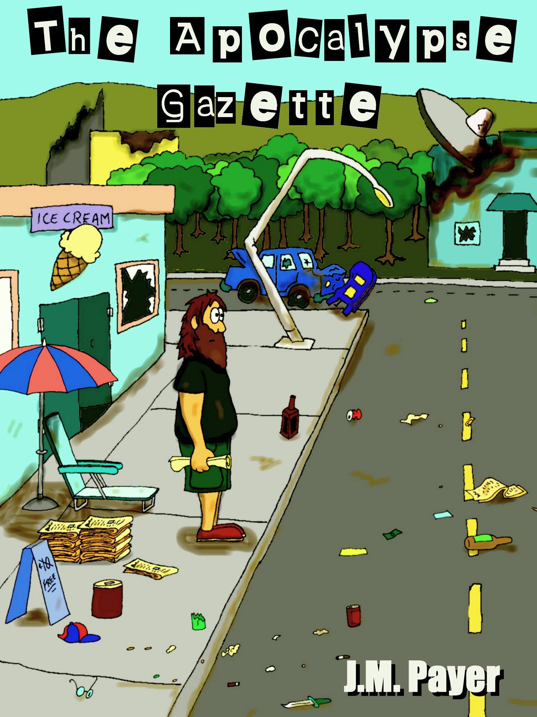

I think the reason I’m having trouble with these is that it’s like the camera is zoomed back too far, there’s too much to look at, not enough focus. They’ll be even worse when shrunk down to thumbnail size. Probably the simplest thing to do would just have the cover be the front page of the paper but that almost seems like a cop out. So, feedback or ideas would be awesome.
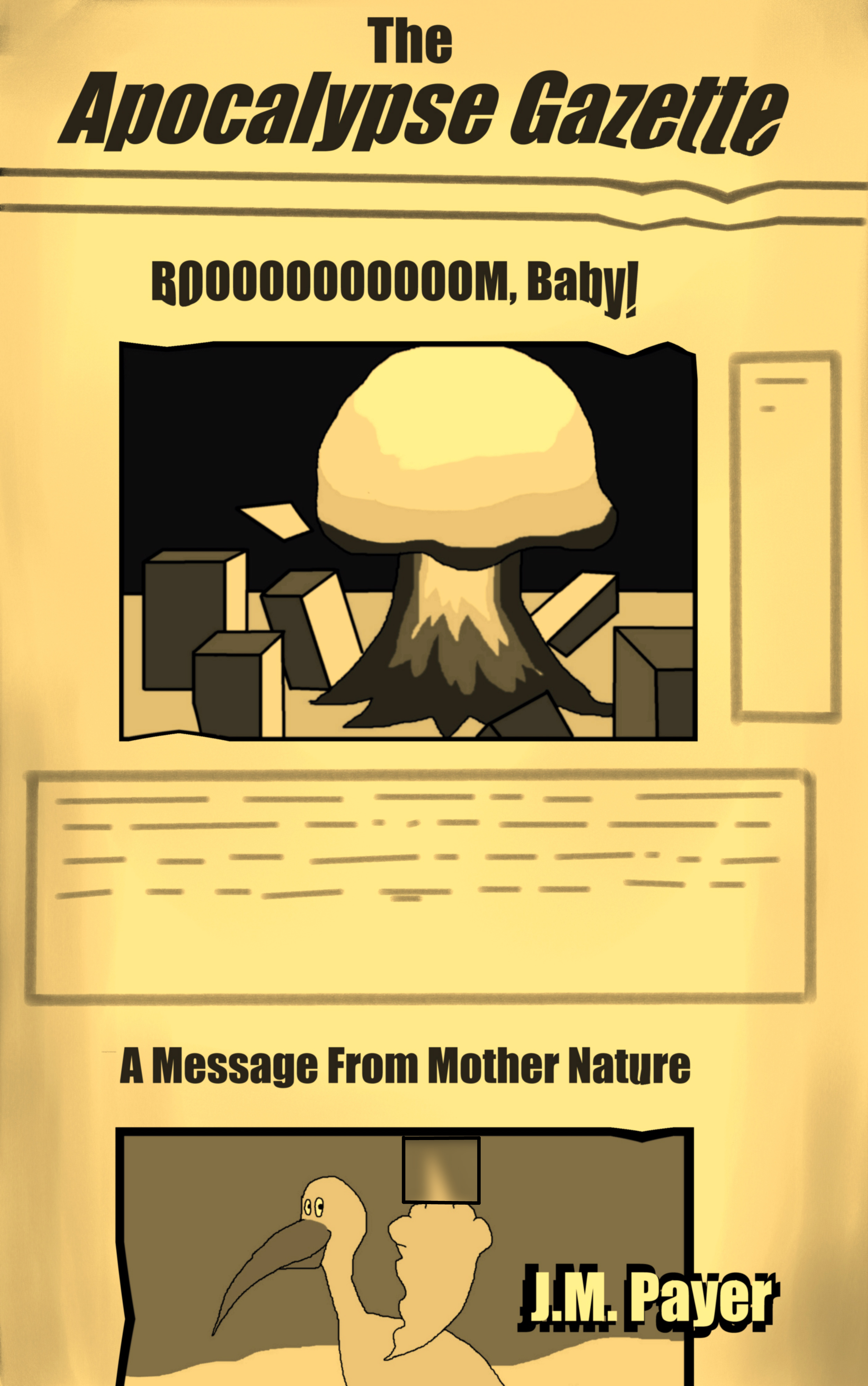
Something simple that sizes down well would probably be better. Something like this, that is far less interesting -or complex.
Even more choices.
